Make the text box size flexible
Make the text box size flexible
To create a layout that's responsive to different screen sizes, you'll now make the text box stretch to fill all remaining horizontal space (after accounting for the button and margins).

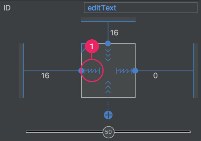
Figure 8. Click to change the width and remove the right margin

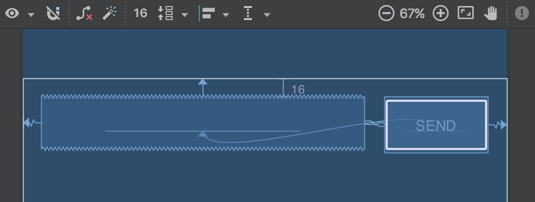
Figure 9. The text box stretches to fill the remaining space
- Create a constraint from the right side of the button to the right side of the parent layout. This now defines the total width that the two views have available (which you can now fill with the text box).
- Add a constraint from the right side of the text box to the left side of the button. It might look like that's already there, but you're actually adding a bidirectional constraint between the two views. So both views are constrained to each other. This is called a chain (as indicated by the chain betwen the views), and it enables some extra layout options.
- Open the Properties window for the text box and then click the width indicator until set to Match Constraints, as indicated by callout 1 in figure 8. "Match constraints" means that the width is now determined by the horizontal constraints and margins. Therefore, the text box stretches to fill the horizontal space.
- However, the two views are separated by 32dp instead of 16dp, because both views have margins. So while still viewing the text box properties, change the right margin to 0, as indicated by callout 2 in figure 8.
Now the layout is done and should appear as shown in figure 9.
If it seems your layout did not turn out as expected, click below to see what your the XML should look like and compare it to what you see in the Text tab.
Run the app
If your app is already installed on the device from the previous lesson, simply click Apply Changes  in the toolbar to update the app with the new layout. Or click Run
  to install and run the app.
 in the toolbar to update the app with the new layout. Or click Run
  to install and run the app.
The button still does nothing. To start another activity when the button is tapped, continue to the next lesson
Comments
Post a Comment