Add Text box & Button
Add a text box

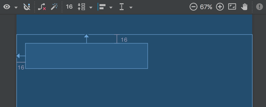
Figure 5. The text box is constrained to the top and left of the parent layout
- First, you need to remove what's already in the layout. So click TextView in the Component Tree window, and then press Delete.
- From the Palette window on the left, click Text in the left pane, and then drag Plain Text into the design editor and drop it near the top of the layout. This is an
EditTextwidget that accepts plain text input. - Click the view in the design editor. You can now see the resizing handles on each corner (squares), and the constraint anchors on each side (circles).For better control, you might want to zoom in on the editor to 75% or higher using the buttons in the toolbar.
- Click-and-hold the anchor on the top side, and then drag it up until it snaps to the top of the layout and release. That's a constraint—it specifies the view should be 16dp from the top of the layout (because you set the default margins to 16dp).
- Similarly, create a constraint from the left side of the view to the left side of the layout.
The result should look like the screenshot in figure 5.
Add a button

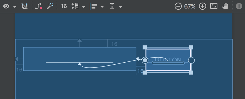
Figure 6. The button is constrained to the right side of the text box and its baseline
- From the Palette window, click Widgets in the left pane, and then drag Button into the design editor and drop it near the right side.
- Create a constraint from the left side of the button to the right side of the text box.
- To constrain the views in a horizontal alignment, you need to create a constraint between the text baselines. So click the button, and then click Baseline Constraint
 , which appears in the design editor directly below the selected view. The baseline anchor appears inside the button. Click-and-hold on this anchor and then drag it to the baseline anchor that appears in the text box.
The result should look like the screenshot in figure 6.
Note: You can also create a horizontal alignment using the top or bottom edges, but the button includes padding around its image, so the visual alignment is wrong if you align these views that way
Comments
Post a Comment